Thursday 25 April 2013

Ancillary: Final Digipak/Vinyl Design


My final digipak prototype came out better than I expected and I am more than pleased with the final product. As well as the digipak, I made the decision to create the packaging for the album to be released on vinyl too and I believe it was a good choice. Photoshop 7.0 paid a significant part in achieving the final product of this ancillary as it allowed me to easily layer text and other images (barcode) over the main original picture. I felt the main graffiti image I used worked great and I believe that it would work effectively as a logo for Jake Bugg as time went on. I made the decision to make the album self titled.

                         Front                              Middle (Booklet)                                   Back

This is the finished template of my digipak. Although the same image is repeated on both the front and the back I believe this look really effective especially after printing and placing in the CD holder itself. The camera that Dan used to take the original image was of high quality as you can tell. I also edited out the background and gave it a blurry effect to ensure that the logo was the main and the central part of the cover. When it came to making the booklet, I used an image from the video I created and added lyrics to the song over it. I chose the red text so it would coincide with the red disk upon opening the CD case. It was essential that the name of the artist on the front sleeve stood out, therefore I made sure it was in capitals and could easily be read over the background.

Here is a physical copy of the Jake Bugg digipak album and what would look like if it was being sold on the shelves in music stores:

As well as the creating the digipak I made the decision to make the album available on vinyl record too. I thought it'd be a great idea especially as Record Store Day was fast approaching. If the album go the go ahead, I had planned to release the album as a limited edition red 12" vinyl with only 1000 copies pressed. I felt this added to the authenticity and would make it much more special for the release and fans of Jake Bugg. I decided to use just Bugg's initials (JB) on the vinyl edition as I felt it looked quite effective against the tiled background.

Here are a few photographs of the physical copy of the vinyl edition:

Ancillary: Digipack Plan

As mentioned in my previous posts I wanted to have an album cover with a logo or stand out image rather than a picture of the artist, despite going against typical codes and conventions of the indie/folk genre. The general idea is to have a hard plastic case with a booklet inside that has images of the artist on and the track list written on the back in the same font as the Artist's name on the front. At first, I was planning to create a logo but my friend Dan had recently gone to Amsterdam for an educational school trip and was showing me the pictures he had taken on his camera. One picture of some graffiti particularly stood out and I thought it'd look great as an album cover. There was also a picture of the graffiti from a different less zoomed in angle which I felt would suit the back cover great too. Dan gave me permission to use both images too which was great.

The concept I was aiming to achieve was actually giving the artist a logo in which people would recognise them by. A good modern example of a band that does something similar is the Red Hot Chili Peppers. This logo would be the face of Jake Bugg and people would associate him with it. Looking towards the future, the logo could make an appearance in music videos and perhaps on future album covers but in various different scenarios and places. Although the image itself is quite basic, I believe it will be really effective and stand out on shelves and online. The front cover of the album would include the artists name on also in black capital letters. As well as creating a digipak for the album, I had an idea of making a vinyl record for it too. If I did come to design it, the general sleeve would be the same but tiled across the front in four squares. Similar to The Smith's 'Meat Is Murder' record. To create the cover for my digipak I plan to use Photoshop 7.0.


Before actually creating the digipak, I quickly sketched out on paper a rough plan of what I wanted it to look like and include. 


Ancillary: Digipak Research

Another task to complete for ancillary work was to compose a digipak for an upcoming album of the artist I am focusing on. I had the general idea of what a digipak was and included but in order to get a better idea of what I should and shouldn't incorporate into mine I did some further research. At first I looked into what digipak's generally consisted of and then those inside my genre. The general design of a digipak is the developed version of a CD, DVD or Blu-Ray Disc packaging. Typically, it includes a gatefold card stock outer binding or paperboard, with at least one plastic disc tray attached to it depending on what CD is and what the artist is offering. A complete digipak usually contains a front cover, back cover and booklet inside. The booklet inside usually has pictures of the artist inside and lyrics of the song on the album, perhaps information on the band/artist and it's members too. In my opinion, the most important feature of a digipak/album is the cover. This is as it's the first thing people will see whether shopping online/iTunes or in-store at a music shop. I personally believe it is essential for the cover to be quirky and catch people's eye as people who may not even be a fan of the particular artist could potentially be drawn in and end up buying it.

I typed into Google 'most influential album sleeves' in order to see what stood out and in general what made a successful album cover. I found this article of 'Rolling Stone Magazine's Top 100 Album Covers' (http://rateyourmusic.com/list/fedderedder/rolling_stones_100_greatest_album_covers). After looking down the list I noticed that a large majority didn't include the artist on the cover and instead had a logo, pattern or other image. There were two albums that I was familiar with but I felt particularly stood out which were, Pink Floyd with their album 'Dark Side of the Moon' and The Velvet Underground's Andy Warhol album. The artwork is so simple and effective yet it catches the eye straight away. Between them, the records have sold over 100 million copies worldwide.


Typical of the genre
After researching influential and successful albums I looked more into album covers within the genre I was focusing on. I came across these two - Miles Kane's 'Colour of the Trap' and Jack White's 'Blunderbuss'. Both artist's are singer songwriters and their music is fairly similar to Jake Bugg's. It is evident from both of these album sleeves that typically, solo artists inside the indie/alternative genre tend to feature on their cover. Also, the colour of the artists are edited to black and white whilst quite a bright and vibrant colour features elsewhere on the cover. I quite like this and would definitely considering doing something similar on my own digipak. There are without a doubt a number of advantages to having the artist appear on the front cover of the album. For example: fans like to see their artist on the cover and it makes the record much more easily recognisable for people who know the artist but may not be aware that they're releasing a new album. Despite this, I personally prefer to have a logo or stand-out image to feature on the cover and plan to do so.


I also looked at the general layout of some digipaks within the indie/alternative to get an idea of what to include on the back and inside. From my own CD collection I came across Kasabian's second album 'Empire'.Typical of most digipaks, the case is made of hard plastic and includes an inner booklet, back cover with the tracklist on and front cover. The booklet inside folds out t feature an image of each member of the band, I quite like the idea and would consider doing something similar when creating my own digipak.


Ancillary: Final Website Design

When I came to create my website I had no problems working out how to use the 'weebly' website and from what I remember it was a lot better and easier than the actual web authoring I had used previously. The website took me about 2 hours maximum to make which wasn't really long at all and I quite enjoyed using the website. I appropriately named the website 'www.jakebuggofficial.weebly.com'. Unfortunately though, as I hadn't paid to register the domain myself and was only using a free website the '.weebly' had to included within the domain name. This didn't bother me too much and if I actually came to create an official website to market an album I'd look into purchasing the domain name. I managed to include everything I wanted to and the website itself look very similar to the original plans. The link is -http://jakebuggofficial.weebly.com/.

Home/First page
This is the home page of the website. As you can see I included a picture of the artist as I previously said I wanted to before. I also used a still from my music video that I liked to break up the text in the 'About the Artist' section. I felt it was important to have the artist's biography on the homepage in order to try and drag the audience in and for them to get an idea of who and what Jake Bugg does, especially considering he's a fairly unknown and upcoming artist. It may not be very visible but in the top right corner of the website I included links to both his official Facebook and Twitter accounts. This would allow fans to keep up to date with information without having to visit the website on a regular basis. These links, as well as the banner picture and navigation bar remain on the screen for every page in the website whilst the information in the bottom half changes. 

Other pages on my website included a videos page, gallery, and contacts
Here is a screenshot of the Videos page. I inserted the embed code in so the YouTube videos would be viewable on the page. I included my video for Trouble Town as well as two of the other official music videos.  

This is the Gallery page. I added six images to begin with and would probably add more to the website as time went on for example the poster for the other ancillary piece. Two of the pictures were stills from the Trouble Town music video where as the rest were just from photo shoots with Jake Bugg. 

This is the Contacts page of the website. I inserted a form so fans of the artist could get in touch and send fan-mail or let Jake know what they think of the video. Any forms submitted get sent to an email address where we would then look into sending a reply. There is also a Useful Links page on the website which includes links to Bugg's YouTube, Facebook & Twitter. 

Ancillary: Website Research & Planning

As part of the ancillary tasks in order to try and promote the artist I was focusing on and their upcoming album I had to design and create a website. I had previously made websites in the past which was great as I had a good idea of how to create them and the general things to include on them. However, it was important for me to specifically research band and artist's website in order to try and get an idea of what they look like and what features are available on them as I had only made sport related and educational websites in the past. Some of the websites I researched were quite complex and included features that I wouldn't be able to create with the tools and software I had available. In general though, each website stuck to a similar pattern and the majority of them included a similar set of pages, which were: biography/about the artist, tour, photos, music videos and contact links. In order to find something that was appropriate for me, the websites I tended to focus on were those of singer-song writers and folk artists. These included, the official website for the artist I was focusing on Jake Bugg, Miles Kane & ex-Oasis man Noel Gallagher.

Jake Bugg

Miles Kane

Noel Gallagher

As you can see there are a number of things that each website have in common. Firstly, they all feature the name of the artist in relatively large writing in the top left. I believe this is quite important and plan to include it on my own. Also, typical of websites in general, there is a  navigation bar with a number of page links relative to the artist as I mentioned previously. Another feature I noticed was that each website includes an image of the artist on the homepage as soon as the website is opened, I feel this is important and shall include it on the Jake Bugg website as it's what the fan's would want to see upon opening the website. The main colours used all tend to be dark too (brown, grey, black), I'm unsure whether this is typical of the indie/alternative genre but I can only assume website's of pop artist's and band's wouldn't look similar. As well as this I noticed the websites included links to their Facebook/Twitter/YouTube pages, I plan to do something similar too. 

Before creating my website, I decided to sketch out a rough plan and idea so I had something to work from rather than making it on the spot:


I plan to use a free website called 'www.weebly.com' to create the Jake Bugg website.  


Wednesday 24 April 2013

Censorship

Media censorship is the action of suppressing any type of speech or public communication that the government, media outlet or other controlling body may deem offensive, harmful or inappropriate to anyone in the public domain. Censorship can be used for a number of different reasons including religious, military, political and moral. When applied to the music industry, media censorship may involve filtering out certain aspects of a song such as inappropriate language or showing a censored version of a music video as it includes violent or sexual images that may not be suitable for people of all ages. An example of an artist who had to filter out his music video as it included inappropriate is Nick Cave and the Bad Seed's with their single 'Jubilee Street'. An uncensored version of the music video is also available on YouTube.


Some artists may go against having their music censored but it means it probably won't get played on mainstream radio especially during peak times or lead to it not being played at all. Radio stations have special methods like 'bleeping' for example to help filter out bad language in songs. The general aim of media censoring is so music can be played at any time, for anyone, on any radio station or television program/advert, etc.

Examples of how pop songs are censored for radio use include:

-Bleeping- when a 'beeping' noise is play over the word or lyric so it cannot be heard.
-Blanking- when the song is completely muted for all or part of the offensive lyric/word in the song.
-Re-sampling- overriding the original lyric with music or a like-sounding portion of vocals.
-Re-singing- replacing the inappropriate lyric with another by singing over. Perhaps a word that sounds similar or fits without changing the context of the original lyric.
-Backmasking- taking the original audio of the bad language and reversing so it can no longer be heard.
-Repeating- repeating the word before the explicit word was used so it isn't as obvious. This can sometimes make the lyric sound strange and hard to understand.
-Skipping- removing the inappropriate word without a time delay.

 Here is an example of a song by Kanye West called '25 to Life' where words that may cause offence are blanked out and can no longer be heard.


Tuesday 23 April 2013

Music Video Plan


Above is an initial brainstorm plan of my music video I made before filming. This helped me come up with a general idea for the narrative of my music video and I used the majority of ideas outlined in the plans.

After what I found from analysing the song lyrics, I was certain I wanted to make a narrative based video with the story taken in the direction of there being the artist/character doing the same thing day after day with no opportunities. As you can see in the brainstorm plans, I came up with the idea of a busker (the artist) waking up and  getting ready to go out busking. The camera would show shots of empty bottles of beer which would later become more relevant towards the end of the video. The busker would then get as much money as they could, people and perhaps dogs or children could possibly walk by to give the place a built up kind of feel to it. After, the artist would then walk off towards a local shop to purchase more beer and then head home. I also came up with the idea for the artist to light up a cigarette as the lyric 'Smoke until our eyes would bleed, sparkle pops up the seeds" sounds but I wasn't entirely sure. The general message I would try and give off from the video is that the artist/main character is living in a 'Trouble Town' and doing the same thing day after day. Living with his parents perhaps off the very little he gets from busking so he can just afford his cans of beer each day.

As the artist of the original song obviously wouldn't be able to perform in the song I planned on asking my friend Nathan to appear as Bugg as he agreed to help me previously. Also, some some extent he looked surprisingly similar to Jake Bugg which was an added bonus! I didn't plan on using an fast editing or cuts in the film to match the music as the song itself stayed at quite a steady and consistent pace and I felt it wouldn't really suit the video and could perhaps disrupt the narrative.

Trouble Town by Jake Bugg - Song Lyrics Meaning/Analysis

The song lyrics for Jake Bugg - Trouble Town are as follows: 

Stuck in speed bump city
Where the only thing that's pretty
Is the thought of getting out

There's a tower block overhead
All you've got's your benefits
And you're barely scraping by

In this trouble town
Troubles are found
In this trouble town
Words do get 'round

Kick the bottom make troubles flee
Smoke until our eyes would bleed
Sparkle pop the seed

Hear the sirens down the street
The kids get light on their feet
Or they'll be in the back seat

In this trouble town
Troubles are found

Sitting on the pavement
Boy you've missed your payment
And they're gonna find you soon

If there's a beating in the rain
If there's a little bit of pain, man
You're the one it happens to

If I talk of getting out
I only hear the laughter loud
It's got an ugly echo
Somewhere there's a secret road

To take me far away I know
But 'til then I am hollow

In this trouble town
Troubles are found
In this trouble town
Fools are found

Sitting on the pavement
Boy you've missed your payment
And they're gonna find you soon

If there's a beating in the streets
If there's a feeling of defeat
You're the one it happens to

Stuck in speed bump city
Where the only thing that's pretty
Is the thought of getting out


As I initially planned on making a narrative based video it was important for me to analyse the lyrics carefully. However, I knew that I didn't want to make the narrative follow each lyric by lyric so I decided to read through them several times to try and get the idea of what message the song is trying to give off and the general meaning of it. 

The song title itself 'Trouble Town' gives off the idea that the town Jake Bugg maybe living in or used to is quite grim with very little opportunity for the young people growing up in it.This is also backed up by the fact that Bugg was brought up in a council house and failed to gain many grades at school. This is supported through the very first verse, also: 'Stuck in the speed bump city, where the only thing that's pretty is the thought of getting out' and 'If there's a beating in the rain, if there's a little bit of pain, man. You're the one it's happening to'. These lyrics bring forward the idea that the place Jake is talking about, which is probably the place he grew up, has very little to offer. In general, the song appears to be quite negative with practically every lyric talking about there's no positives to living in the 'Trouble Town'. 'For example: 'Sitting on the pavement, boy you've missed your payment and they're gonna' find you soon'. Overall, I quite like the lyrics and it's one of the main reasons I chose to create my music video with this song in the first place.

I plan to take the idea of the music videos towards the direction that Jake Bugg or the person he appears to be talking about in the song, not necessarily relating to every lyric in the song but giving the video the kinda feel that the artist/character has no life ambitions and is stuck doing the same thing day after day without any opportunities to change. 

Initial ideas for the narrative include the artist/main protagonist working in a dead-end job on little pay each day or walking to do the job centre each day to look for a job. 

About the Artist

Jake Bugg
As I chose a song by an artist I was already familiar and a fan of, researching into the artist wasn't too difficult. Jake Bugg is a 19 year old English singer-songwriter from Nottingham. He takes influence from various different bands and artists including Jimi Hendrix, Oasis, Arctic Monkeys, Donovan and Johnny Cash. After releasing his first and only EP to date 'Taste It', his debut self titled album was released towards the end of October 2012 and includes hit songs Trouble Town and Lightning Bolt. At the age of just 17 years old, he was chosen by the BBC to perform on their BBC Introducing stage at Glastonbury where he went on to get a recording contract with Mercury records. Singles from the album include: Country Song, Taste It, Lightning Bolt, Seen It All, Two Fingers and of course Trouble Town.

On several occasions he has been dubbed the 'East Midlands answer to Bob Dylan' and has also made appearances on the hit music television program 'Later with Jools Holland'. As well as this, Bugg has supported the ex-Oasis man's solo project Noel Gallagher's High Flying Birds on their American tour and the Stones Roses. After the release of the album, Jake took part on a tour across the UK and Ireland selling out venues from over 10 locations. 

On Wednesday 20th February, Jake was nominated for the 'Best British Breakthrough Act' at the Brit Awards but narrowly missed out to fellow folk/indie-pop singer song-writer Ben Howard. Here is a short clip of the teenager being interviewed shortly after the awards, giving his opinions on the awards themselves and pop boy band One Direction. 


Contacting the Artist

As Jake Bugg's song Trouble Town I wanted to use for my music video was copyrighted it was important for me to try and get in some form of touch with the artist before I used it. In order to try and get permission I used social networking website Twitter and email. I found the email address via Jake Bugg's official website.

                              Here is Part 1) of the message as Twitter only allows you to send 140
                              character messages at a time.
                             Part 2)

I also contacted the artist via email using Microsoft Outlook after finding an email address of Jake Bugg's management on his website in the 'contacts' section. 

   As of yet, I have failed to receive a response from both forms of communication. 


Monday 22 April 2013

Song Choice

At first, I thought choosing a song for my music video would have been an easy task but it turned out to be the complete opposite. I was adamant I wanted to use a song inside that fitted into the indie/alternative genre. Also, after researching my target audience I knew I wanted to create a narrative based music video that featured the artist but without any lip syncing or performance throughout. Also, the song has to be around three to three and a half minutes in length. Personally too, I wanted it to be a song I quite enjoyed as I felt I'd enjoy creating and documenting it much more. I used YouTube, Spotify and Last.fm to search for the right song. Last.fm was probably the most helpful as it allowed me to search by genre meaning I could find a lot more songs I may not have already been aware of. As I'm familiar with music within the genre  I wanted to focus on, initial songs I chose were from solo artists I was personally a big fan of, Miles Kane and Jack White. One of the songs I found were 'I'm Shakin'' (Jack White), originally an early 60's blues song by Little Willie John. The other, an original song called Inhaler (Miles Kane) from his debut album Come Closer. Both of these songs were quite lively and upbeat. I eventually came to an initial decision to use Inhaler as the song for my video. I managed to come up with a few initial ideas and even started to film some footage but I found it quite hard to fit a narrative to the style and speed of the song and realised I needed something much slower.

Jack White - I'm Shakin'

Miles Kane - Inhaler

Final Decision
Finally I made the decision to use a song by 18 year old folk singer songwriter Jake Bugg. The song was called Trouble Town and I had been aware of it for a while after coming across it earlier in 2012. It suited what I was looking for perfectly, it was the right pace and met the genre requirements. The only problem was that it was a few seconds under 3 minutes but this shouldn't of been too much of a problem and the video ended up being a good 15 seconds over 3 minutes when finished. I also really like the lyrics and I felt I could make quite a good music video that related to them well. The original song and music video can watched here:

Jake Bugg - Trouble Town

Music Video Textual Analyis - The Age of the Understatement by The Last Shadow Puppets


The Last Shadow Puppets - The Age of The Understatement 

This is the music video for Alex Turner and Miles Kane's side project The Last Shadow Puppet's single 'The Age of the Understatement'. It's directed by Romain Gavras and is 3 minutes 14 seconds long. I chose to analyse this video as I planned on making my video of similar length and also wanted to use a song within the same genre. The video is quite hybrid, it features a narrative, the artist themselves and it's performance based too.

The music video opens with an establishing shop of an ice rink. This creates an enigma as the audience would want to find out what happens next. When related to Todorov's Theory for example, this shot also sets up a state of equilibrium of the narrative within the video. Next, the audience begins to feel quite tense as the build-up of sound is met with the close-up of a young girl putting on her ice skates. Shots of her worried and concerned facial expressions leave the audience as ease. The young girl then begins to skate on the ice rink to he pace of the music which has quite a strong rhythm whilst the cuts in the video also correspond to the beat of the song. This helps build tension and adds to the enigma created by the opening shot. It is important that this is done fairly early on in the video in order to keep the audience interested and intrigued for the rest of the video. 

Unsuspectingly, the camera then cuts to another long establishing shot of two men standing by soviet army tanks. It is at this point that the two main artists of the band are introduced. Slowly, the camera steadily zooms towards them again in beat of the music. They are framed in the centre of the frame portraying their importance and status. The video shows a medium shot of both them in front of two tanks just as the lyrics in the song begin to start. The band member's clothes are fairly stereotypical of the “indie/alternative” style as they sport long trench coats and Beatle-esque haircuts. Many people watching this video especially fans of music within this genre will be able to relate to the band members through the use of iconography and other elements of mise-en-scene. Again, the camera changes to a medium shot Miles and Alex walking with the rhythm of the music. The mise-en-scene of the soviet tanks in the background can still be seen which makes the audience consider whether something quite serious is to happen next. As well as this, the general setting is quite desolate with snow which perhaps connotes the isolation and loneliness of both characters.

The mise-en-scene in the video also implies connotations of age and create quite a dated kind of feel towards the video. For example, the lighting is quite dark throughout and appears to have a sepia tint.  Many other indie videos tend to be quite similar as many bands inside the genre tend to get their musical influences from older generations including band's from the 60's such as The Beatles, The Kinks and The Animals, so in general this video sums up the type of music they produce.

There is then a setting change when the camera cuts to the band members driving through a brightly lit Russian city, this is quite a contrast in comparison to the previous empty setting. Again, the importance of the two band members is highlighted through a low angle shot which looks up to the characters. This relates to the audience of the band as many of them are young and look up to them as idols. Throughout the music video, Alex Turner and Miles Kane tend to dominate each frame even when stood in front of the large menacing army tanks in the snow. The setting then changes again to a church. Again, this contrasts with the original settings of the tanks and also creates a binary opposition between religion and war. 

As the pace of the music picks up towards the end of the song, the amount of cuts increase too. This helps create a pace between the visuals and which both the eyes and ears can follow. The girl ice skating is also re-introduced towards the end too. Like at the start of the song,  her movement fits the pace and rhythm of the song and she slows down as the beat changes. Finally, the video shows a high angle long shot of the Russian army standing in formation. This shot could be showing the new equilibrium, as towards the beginning they were out in a so called 'wilderness' with the tanks yet now they're back at what appears to be important government buildings after overcoming their problem/task.  

UK Vinyl sales up 78 percent in 2013


Despite the fact that many people consider the vinyl record to have already died, recent data according to the Official Record Store Chart suggests otherwise. In the first quarter of 2013, results show that vinyl record sales have increased by a significant 78 percent. This isn't random nor a shock rise however, as last year (2012), vinyl sales surged up by 15 percent across all genres to an impressive 389,000 copies sold, the highest since 2004. Although independent record stores only accounted for thee percent of all albums sold in 2012, they managed to contribute towards more than 35 percent of all vinyl sales in the UK. With data collected by the Official Record Store Charts company, it takes in account sales from some of the biggest stores in the country including London's Rough Trade, Piccadilly Records in Manchester and Crash Records (Leeds) among others. The official  weekly chart is published each Sunday, last week it was announced that folk band Mumford and Son's hit album 'Babel' was the biggest selling record in the last 12 months sold by independent record stores. The other four top selling vinyl records of 2012/13 include Emelie Sande's 'Our Version Of Events' (2nd), record store day ambassador Jack White with Blunderbuss at number three and albums from The xx and David Bowie at to finish of the top 5. This news in general is great for the music industry and community, especially after the recent actions taken towards HMV's future. Also, these results and data bring forward that it isn't at all the end for the vinyl record but potentially a new beginning. Sales will only continue to increase and no doubt that 78% rise will significantly be exceeded especially with Record Store Day fast approaching.
The full UK Official Vinyl chart for 2012/13 was as follows:

Mumford & Sons - Babel
Emelie Sande - Our Versions of Events - 
Jack White - Blunderbuss
The xx - Coexist
David Bowie - The Next Day

Alabama Shakes - Boys & Girls 
Alt-J - An Awesome Wave
Jake Bugg - Jake Bugg
Nick Cave & The Bad Seeds - Push The Sky Away
Richard Hawley - Standing at the Sky's Edge


Thursday 18 April 2013

Audience Research: Questionnaire

I felt a questionnaire was an effective way to reach my target audience as it is a quick and practical method to collect quantitative data. Participants don't have to spend too long answering the questions as they only have to tick a box. They don't have to think too hard about their answers as they are picking from a multiple choice and the questions are closed ended, therefore meaning those involved not having to expand on their answers. It is also easy for me to make observations and conclusions from the final results.

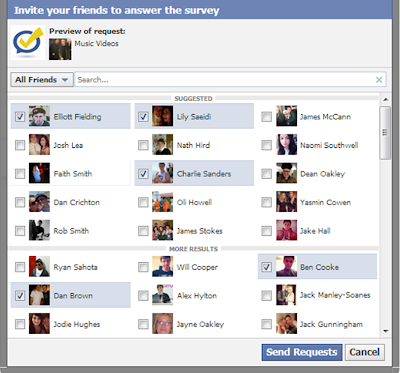
I used an application on Facebook called 'surveys for Facebook'. With over 900 friends on the social networking site, I thought this would be a much better way to reach my audience especially as the majority of my friends tend to young. It allowed me to add the questions and answers and invite the people I wanted too. This was great as I specifically wanted to ask certain questions and I decided to invite certain people who I knew were interested in the genre I felt I wanted to focus on (indie/alternative/folk rock).

Step One - Creating the Survey
Here, I created the survey, giving it an appropriate name (Your Ideal Music Video) and inserting a description so the audience have some instructions on what to do, etc.

Step Two - Adding the Questions and Answers
Here is the finished questionnaire after I added the questions and answers. I included age and sex in order to split up my audience and see if males or females tend to prefer one thing from the other. Other questions included what sort of videos do people prefer and whether they prefer to see the artist feature in the video. 

Inviting Friends to Answer the Questionnaire 
Finally, I selectively sent certain people requests to answer my survey. These were all people I knew had a similar preference in music that suited the idea of music video I wanted to make. Overall I selected 60 participants to take part in the survey. 

My Results
After sending requests out to 60 people to fill out my questionnaire on music videos I received roughly 30 replies which was great. After collecting and bringing the results together I found that overall people preferred narrative based music videos that include the artist. Generally people also felt 3-4 minutes was the appropriate length for a song but didn't really like videos that featured the artist singing or lip syncing the lyrics. Finally, the average age of my respondent audience was 16-20. However, this was expected as the majority of people I have on Facebook have a similar age as me.

Genre Characteristics

There are various different genres in Music today and with each typically comes a different style of music video too. I have researched four different music genres, Rock/Metal, Pop, Indie/Alt, and R&B/Rap and highlighted what makes them different from each other.

Rock/Metal Music Videos - Avenged Sevenfold - Nightmare

In general, Nightmare by Avenged Sevenfold is quite typical of it's genre. As a whole the lighting throughout the video is very dark and has quite a mysterious tone which you'd expect when watching a metal video. This video, as well as other similar videos is performance based, with the band performing throughout the song and lead singer lip syncing alone at various points. The video is hybrid however, the video doesn't just feature the band performing but there's a narrative base to it too. From the song and meaning of the lyrics, the narrative re-creates a nightmare inside what appears to be a mental asylum. There are lots of quick cuts when the music becomes faster and louder and shots of blood and patients in the hospital are quite shocking for the audience. The general mise-en-scene in metal/rock music videos tends to include people with tattoos or piercings and again the lighting is always dark and mysterious.


Pop Music Videos - JLS - Everybody in Love

The video for  Everybody in Love by JLS and practically every single other pop music video is the complete opposite of those in the rock/metal genre. Rather than being very dark throughout the video, it's much more bright, lively and vibrant. The video is also performance based and the band seem to dance to a routine throughout but pop videos generally tend to focus more on the appearance and image of the artist in order to appeal to their audience. (P.s. Please take into account I had to listen to this song as least once the whole way through in order to write this. Oh, the pain).


Indie/Alternative Music Videos - The Courteeners - Not Nineteen Forever

As music in the alternative genre is so widespread there aren't particularly any codes and conventions of indie music videos rather than them being quite unique and different. In this case, The Courteeners sound fits into the 'lad rock' section of indie music. The video includes the lead singer Liam Fray lip syncing in a cafe and the video seems much more genuine and authentic than a typical pop video. Other indie music videos can often be quite symbolic and picturess.


Rap/R&B Music Videos - T-Pain - Church
Common characteristics of rap and R&B videos tend to include the artist centre stage throughout the video often driving expensive cars or surrounded by half naked dancing women. They are fairly similar to pop videos in the way that the artist's image is the most important thing. Music videos in this genre usually include the artist miming as well and if any feature narrative it's usually based on the lyrics. As a whole, rap videos are quite positive and upbeat rather than dark and grim in comparison to the metal/rock genre.


Wednesday 17 April 2013

Uses and Gratifications Theory


The 'Uses and Gratifications Theory' which can also be referred to as the Needs and Gratifications Theory is quite an influential tradition in Media research. In 1974, the theorists, Katz, Blumler and Gurevitch suggested that the media play an active role in choosing and using the different types of media people use. The Theory brings forward that the media user seeks out a source that best suits their needs and focuses on why people use particular media rather than on the content itself. In contrast to the concern of the 'media effects' idea with 'what media does to people', Uses and Gratification tends to highlight 'what people do with media' instead resulting in a more varied set of responses and reactions. Not only can it be applied to music but to all types of media including television and magazines. However, some people have criticised the theory in the past stating that research could be unreliable as reports rely on user's memory rather than actual data as well as people potentially getting too emotionally drawn in perhaps resulting biased results.

The theory has four main principles:

  • Diversion: The need to escape from everyday routine and problem to relax.
  • Personal Relationships: People use different forms of media to help form relationships and to fulfil their needs for companionship.
  • Personal Identity: People often use the media to reassure themselves, to find things out for themselves and to perhaps reinforce personal well being. 
  • Surveillance: To find out what's going on around us, finding information through media that might affect us or those around us.
In Relation to Music
- Diversion can prevent boredom and make people relaxed. Perhaps putting on a relaxing album or song in a dark room. 
- When lyrics in certain songs may relate to a personal relationship between two people.
- Personal Identity will allow people's emotions to relation to certain songs. 
Surveillance of music could help people find out about how other people in the world may live through cultural music.

When researching the Uses and Gratifications Theory, Katz, Blumler and Gurevitch introduced 5 components compromising the model. These were:

1) "The Audience is conceived as active."

2) "In the mass communication process much initiative in linking gratification and media choice lies with the audience member." 

3) "The media compete with other sources of satisfaction."

4) "Methodologically speaking, many of the goals of mass media use can be derived from data supplied by individual audience members themselves."

5) "Value judgements about the  cultural significance of mass communication should be suspended while audience orientations are explored on their own terms." 


Katz, Blumler & Gurevitch (Left to Right)


Tuesday 16 April 2013

Music Video Analysis / Switchblade Smiles


Switchblade Smiles by Kasabian was the first single from their 2011 album 'Velociraptor'.  The genre of the band/song would fit into the indie/psychedelic rock genre and in general the video is typical of it's genre. The length of the video is 4 minutes 16 seconds long and it was uploaded to YouTube on the 15th July, 2 months prior to the release of the album. It was produced by renowned filmmaker Charlie Lightening who had previously worked on music videos by Arcade Fire and short documentaries for Liam Gallagher's clothing label 'Pretty Green' and directed by conceptual designer Aitor Throup. Although the majority of the video consists of just black and white editing the contrast of the film has just been lowered significantly which is quite common with videos in the indie/alternative genre although there are some hints of vibrant colour throughout which look quite effective. The video is mainly performance based but rather than the band just performing on a stage throughout, they're performing in front of some form of green screen in order to create a 'white room' effect. The camera rarely stays in one place during the video and there are a wide range of different shots from various angles. 
           

The entire band themselves appear to be wearing completely black clothes in order for them to stand out effectively on the white background. Tom Meighan and Serge Pizzorno, the guitarist/vocals and lead vocalist from the band seem to take centre stage in the video and appear more than the other members. However, this is quite typical for Kasabian as these two members tend to usually feature in Radio or Television interviews and magazine shoots over the rest of the band. Not only is there footage of the band performing in the video but various different shots of the band doing various things that to keep in sync with the music. For example, at several points throughout the songs there is the sound of both Serge and Tom simply singing 'Aaaahhhhhh' for fairly lengthy periods of time and the video matches this with the two members shout the lyric to each other. This is a great way to start the video of a fairly up beat and lively song, foreshadowing what is to come. 


This and other similar parts during the music video also draws attention to the lyrics of the song. As well as close ups of both Serge and Tom lip syncing appearing on various occasions throughout, quite a stand out lyric 'MOVE' fills the screen in bright red writing whenever it sounds in the song. This is very effective in my opinion and the colour makes it really stand out in front of the back drop of just blacks, whites and greys. To match this, the white back drop also turns to red later on in the video. Other videos that include similar conventions are Azealia Banks' hit single '212'. 


The editing includes lots of short snappy cuts in certain places especially when the music gets quicker and louder. The camera is only completely still on the odd occasion as the majority of the shots pan or rotate in various different directions. When searching for the Switchblade Smiles video on YouTube, I came across the 'Making Of' video which I found very interesting and helpful  when writing my analysis of the video. 


Sunday 14 April 2013

Codes and Conventions of Music Videos


Camera shots
Generally, a lot of music videos contain a lot of close up shots, particularly of the instruments in which the artists are playing. This can often be to show the emotions of characters in narrative based videos or to please the audience and show the artist/band's face. High angle shots are used too where often the camera is on a crane looking over the stage, getting a wide view of everything on show. Pans and tilts moving from different performers, especially in the case of a band as they often pan from each member of the band. 

Editing
Conventionally of a music video the editing often involves lots of jump cuts and cutting to/from different narratives or angles which is done to keep the audience interested and at ease. Other forms of editing also includes split screens, this shows more than one angle to the video. This also helps attract the viewer's attention. If the music video is narrative based, split screen editing allows it to tell two stories rather than just one. When a video doesn't have as many cuts it can often be because the artist aims to create a mood. This style of editing is much more common in female solo artists music videos who appeal to a wide audience.

Mise-En-Scene
The importance of mise-en-scene tend to depends on what what music it is and what genre the music may fit into. In the indie genre the artist/actors in the video would usually stick to one outfit but in pop videos the artists especially could wear 2-3 or more. Usually in narrative based videos costume changes don't occur. The location also depends on what type of music video it may be. Narrative based videos genuinely tend to include more than one location but performance music videos usually just focus on one setting (the stage). Mise-en-scene can be a significant way of how the artist may be portrayed by different audiences when watching the video. For example, high-key or low-key lighting could represent the different between whether the video/song is quite dark or positive. 

Styles of Music Videos
Music videos can be categorised as there are many different types of music videos that people choose to have. These include:

Performance based - this is where the video focusses on the band or artist playing the music and singing the song. Close up shots of the singer or band allow the audience to feel intimacy with them. Typically, fans of artist's quite like performance based videos as they'd rather see the band/artist themselves. Performance based videos can be made on a fairly cheap budget. An example is Peace with their single 'Follow Baby'. 

Narrative based - Videos that tell a story as the music video progresses. Usually the story being acted out in the video is based on the meaning of the lyrics in the song. These videos are used quite frequently and in various different genres too. There are a number of different theorists of narrative based videos including Todorov who suggested that these types of videos are split up into different parts. The video begins in a state of equilibrium where everything if fine. Then, an inconvenience or problem occurs which has to be solved in order to return to the original state of equilibrium. An example of a narrative based video is Tame Impala with their song 'Mind Mischief'.  

Narrative and Performance based (Hybrid) - Music videos that show the artists performing yet also tells a story simultaneously. These videos give the artist much more freedom as they can practically include what they want. Again, audiences like a mix of both narrative and performance as they get to see the band play as well as there being some sort of storyline to it. An example is the Rolling Stones with their latest song 'Doom and Gloom'. 

Cameo performance based - Videos that the band features in however does not perform. These videos are quite common. Audiences tend to enjoy seeing the artist or band member(s) acting as a character in the video and it can often keep them interesting. An example is 'Suck it and See' by Arctic Monkeys. 

Animation based - The music video is created digitally. With the advancement of technology and CGI, animation based videos have become more and more common. It can be very effective in many cases and the editing can suit the audio very well. This is an example, it's the music video to 'Feels Like We're Only Going Backwards' by Australian modern psychedelic band Tame Impala.